Prediction Scatter Plot
🔮 What is this?
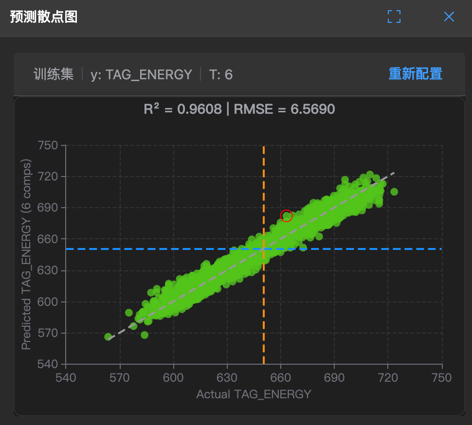
This is the report card for PLS models. It compares the model's predicted values (what I guess) with the actual values (what it really is).
It allows you to see at a glance: How accurate is the model?
🧐 How to read?
- X-axis: Actual observed values.
- Y-axis: Model predicted values.
- Ideal line: There is a 45° diagonal line.
- Good model: All points neatly line up on this line.
- Bad model: Points are scattered like beans everywhere, completely unrelated.
🛠️ How to use?
Note: This chart has a lasso function for selecting abnormal parameters.
- Check distribution: If points are scattered, it indicates the model has large errors (high RMSE).
- Find deviations: If points are generally below the line, it indicates the model has systematic underestimation (Bias).