t1-t2 Score Plot
🗺️ What is this?
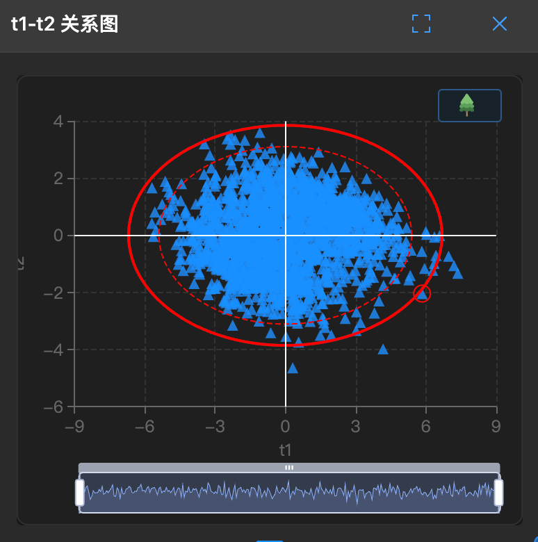
This is a panoramic map. It compresses dozens of data columns onto a two-dimensional plane (PC1 and PC2), allowing you to see at a glance who is in which group.
It shows the positions of samples (rows) in the principal component space.
🧐 How to read?
- Clustering:
- If points cluster in the middle, it indicates data stability.
- If points form two separate clusters, it means there are two different "groups" in the data (such as different batches, different processes).
- Outliers:
- Those points that are far away and isolated are maverick outliers.
🛠️ How to use?
Note: This chart has a lasso function for selecting outliers.
Draw circles: Use the mouse to circle a group of points to see if they all come from the same time period.
Comparison analysis: The first selected points will be marked in red. Subsequent selected points will be marked in blue. Click
Comparison Analysisto observe parameter contributions.