X+Y Loading Plot VIP Exclusive
🔀 What is this?
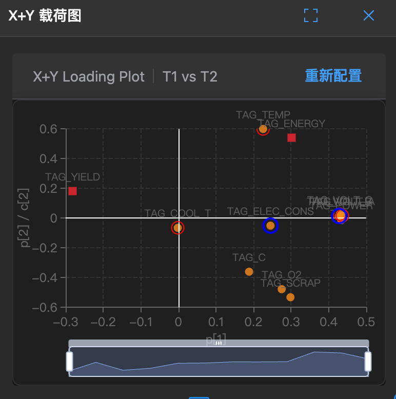
This is a hybrid loading plot that places X variables (causes) and Y variables (results) on the same chart.
It allows you to see at a glance: Which causes (X) have the greatest impact on results (Y)?
🧐 How to read?
- Points:
- Blue points: Usually represent X variables.
- Red points: Usually represent Y variables.
- Relationships:
- If a blue point (X) and a red point (Y) are close together, it indicates they are highly positively correlated (e.g., adding catalyst increases yield).
- If they are opposite each other across the origin, it indicates highly negative correlation (e.g., too high temperature reduces yield rate).
🛠️ How to use?
Note: This chart has a lasso function for selecting abnormal parameters.
- Find key factors: Focus on the Y you care about most (e.g., "yield rate") and see which X is closest to it - that's the key.
- Optimize process: If you want to improve Y, adjust the X variables that are positively correlated with it.