Attribute Box Plot
📦 What is this?
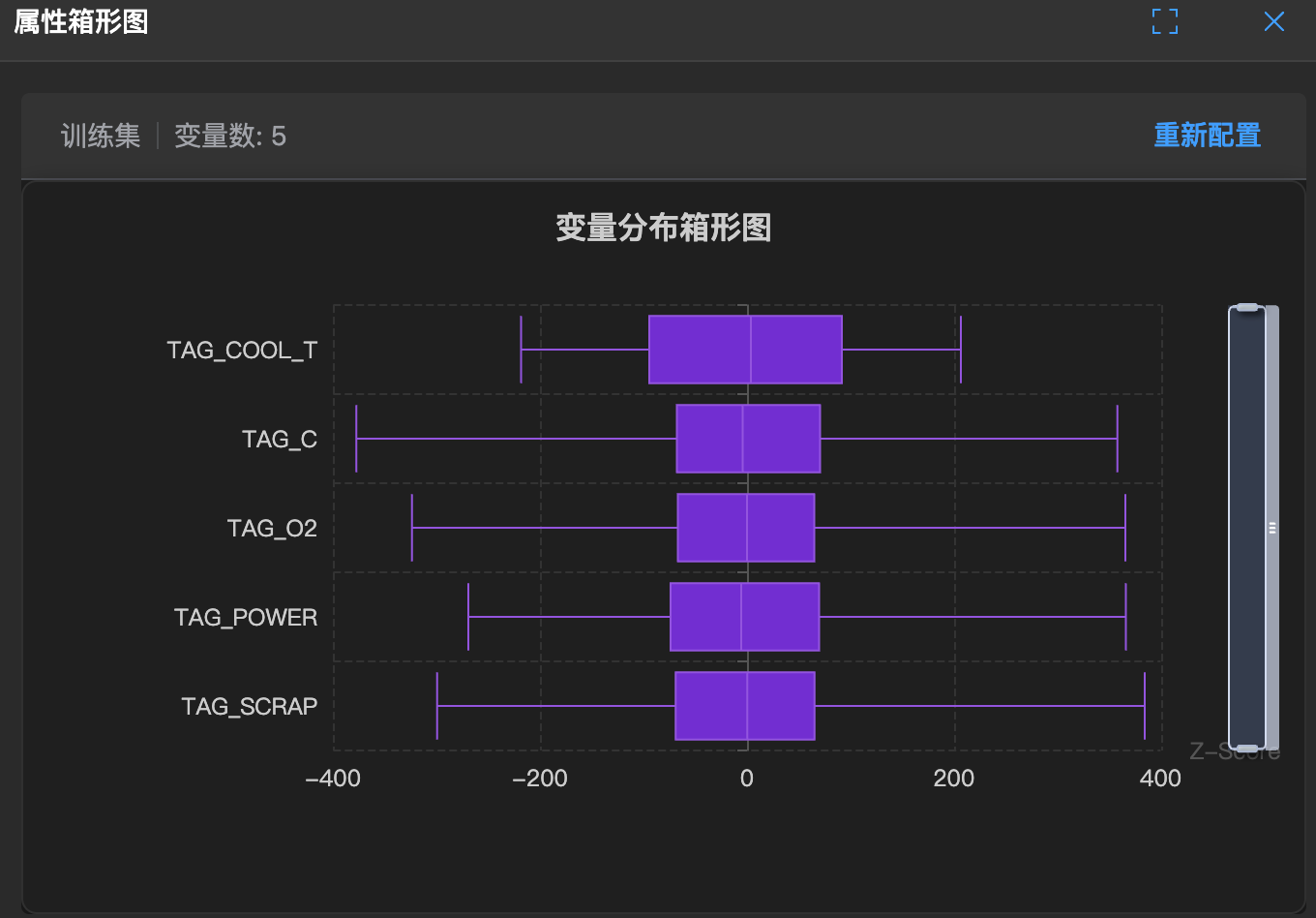
Imagine putting all data into a delivery box and only looking at the most important points. The box plot is this box.
It doesn't look at details, only the overall overview: the top lid (maximum value), the bottom (minimum value), and the middle belt (median).
🧐 How to read?
- Box (square): Contains the middle 50% of data. The shorter the box, the closer everyone is (small variance).
- Horizontal lines (whiskers): Two lines above and below, connecting the maximum and minimum values.
- Circles (outliers): If there's a point outside the box, it's a troublemaker (outlier).
🛠️ How to use?
- Quick comparison: If you have several variables (such as scores of several classes), draw their boxes side by side to see who is higher or lower at a glance.
- Catch troublemakers: As long as you see circles outside the box, you know someone didn't take the exam seriously.