Attribute Heatmap
🔥 What is this?
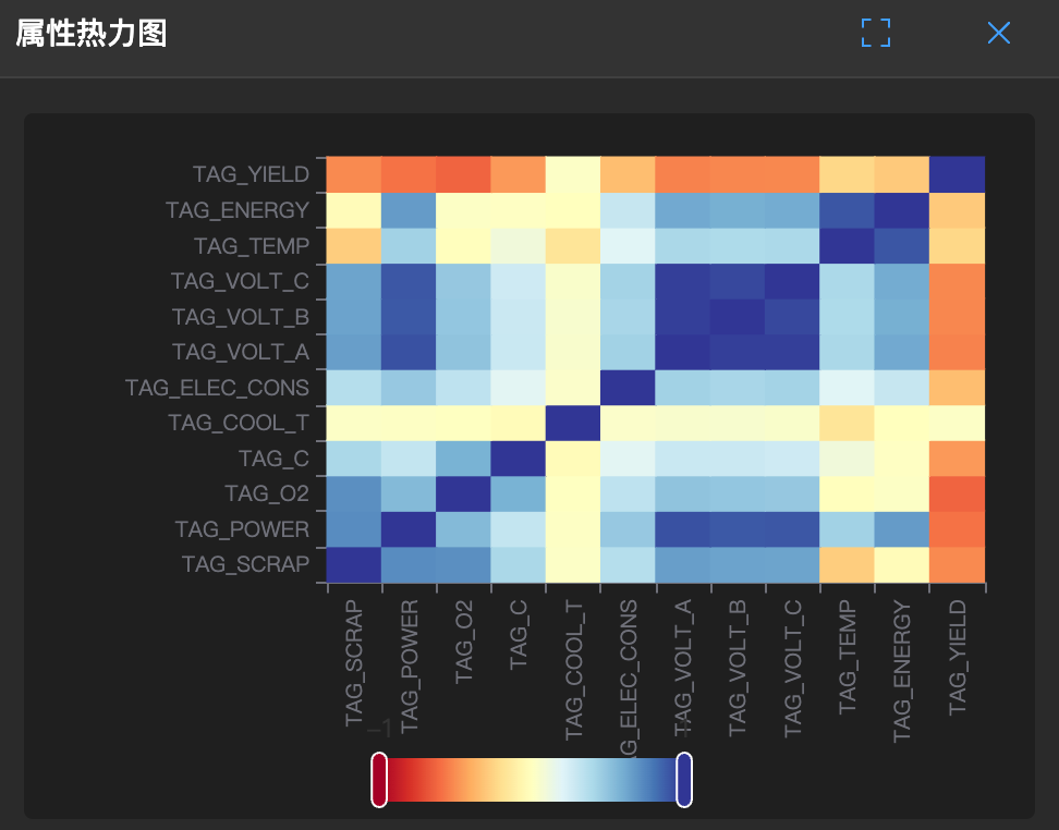
Imagine a temperature distribution map where red areas are hot and blue areas are cold. The heatmap uses colors to represent relationships between variables.
It places all variables in pairs to see if they "have a mutual understanding".
🧐 How to read?
- Cells: Each small cell represents the intersection of two variables.
- Colors:
- Red: Hot relationship (positive correlation). When you rise, I rise; when you fall, I fall.
- Blue: Cold relationship (negative correlation). When you rise, I fall; opposing each other.
- White/light colors: No relationship, you are you, I am me.
🛠️ How to use?
- Find good friends: Scan at a glance, which area is reddest? Those variables are a group.
- Simplify variables: If two variables are always extremely red, it means they are saying the same thing. You can consider deleting one to save effort.