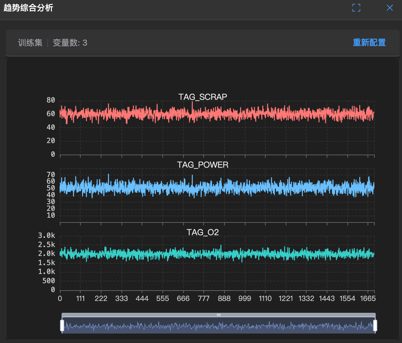
Multi-Trend Analysis
📈 📉 📈 What is this?
Imagine a conductor's podium where all instruments are playing simultaneously. The multi-trend chart is this podium.
It plots all variables' trend lines together (usually stacked or overlaid), allowing you to see at a glance who is following whom.
🧐 How to read?
- Parallel lines: If two lines always fluctuate in parallel, they are good friends (synchronized).
- Mirror lines: If one line is high when the other is low, they are enemies (inverse phase).
- Chaotic lines: If one line jumps randomly while the other doesn't respond, they have no relationship (unrelated).
🛠️ How to use?
- Find causality: For example, if you suspect temperature increase causes pressure to rise, check if temperature peaks always appear slightly before pressure peaks (lag effect).
- Monitor the whole system: Like reading an electrocardiogram, if any line is abnormal, the entire system may have problems.