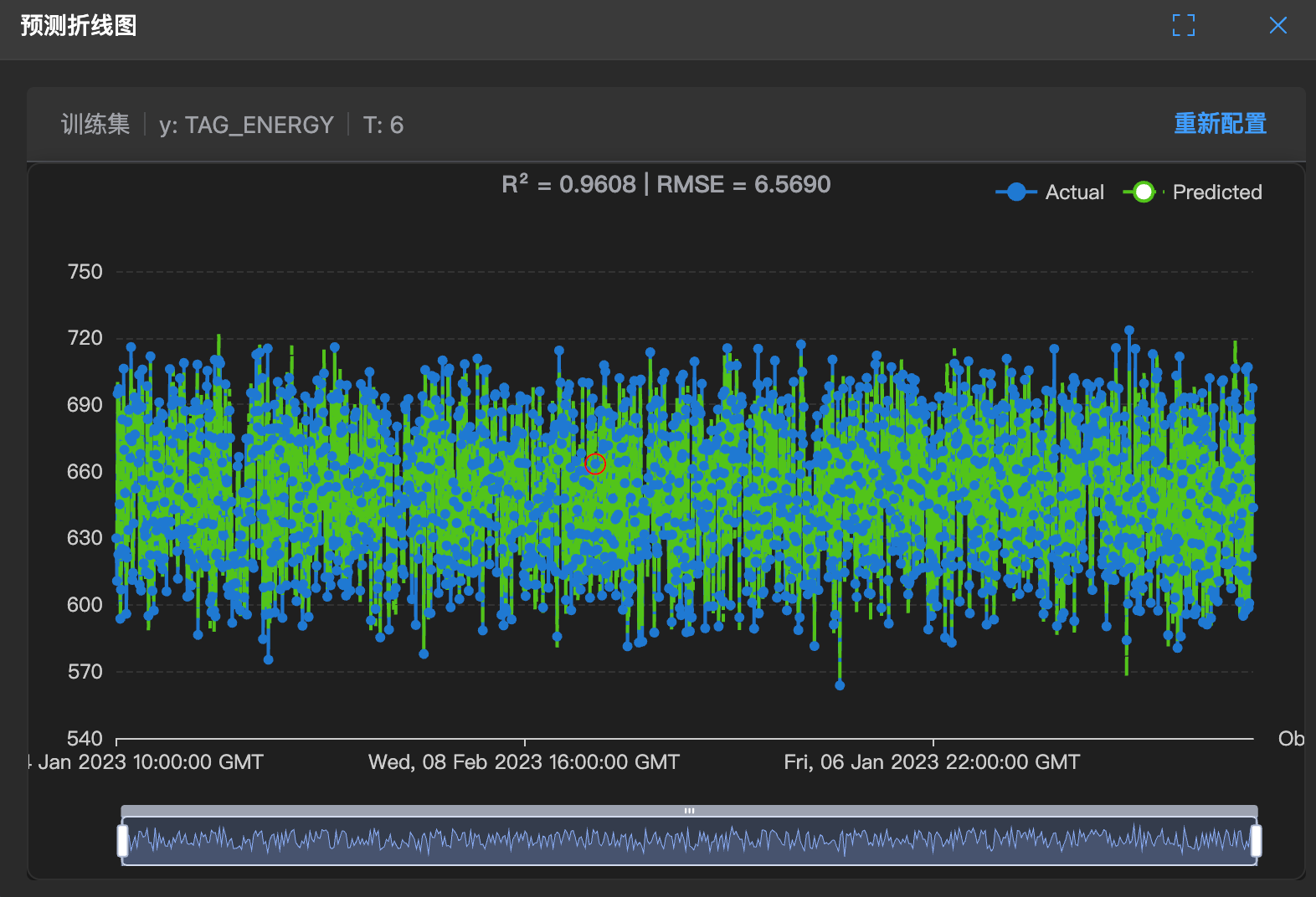
Prediction Line Chart
📈 What is this?
This is a time series prediction chart. It plots both actual values and predicted values as line charts, allowing you to see if the trend is correct.
It allows you to see at a glance: Has the model captured the rhythm of data changes?
🧐 How to read?
- Blue line: Actual values.
- Green line: Predicted values.
- Overlap: If the two lines almost overlap, it indicates the model is super accurate!
- Deviation: If the blue line is above and the green line is below, it indicates the model always underestimates.
🛠️ How to use?
Note: This chart has a lasso function for selecting abnormal parameters.
- Find lag: If the green line is always slow, it indicates the model is slow to react.
- Check sudden changes: If the blue line suddenly jumps but the green line doesn't respond, it indicates the model hasn't seen this situation before.