Comprehensive Correlation Analysis VIP Exclusive
🤝 What is this?
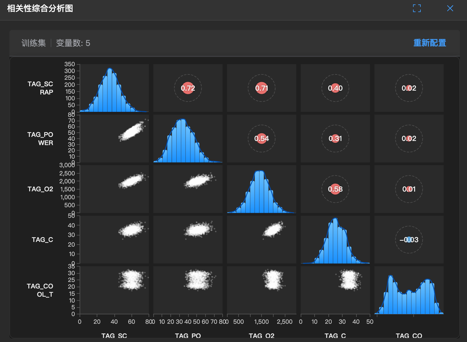
This is a panoramic relationship chart. It not only tells you who is related to whom, but also how good the relationship is.
It combines scatter plots (check specific points), heatmaps (check overall colors), and coefficient tables (check specific numbers).
🧐 How to read?
- Upper triangle: Usually heatmap or numbers. Redder means more positive correlation, bluer means more negative correlation.
- Lower triangle: Scatter plots for each pair of variables.
- Points form a line: There is a real relationship (linear correlation).
- Points scattered like clouds: The relationship is weak (unrelated).
- Diagonal: Distribution histograms for each variable itself.
🛠️ How to use?
- Comprehensive check: If you want to understand all variable relationships at once, this chart is enough.
- Verify assumptions: Do you think A and B are related? Check if the corresponding scatter plot forms a line.