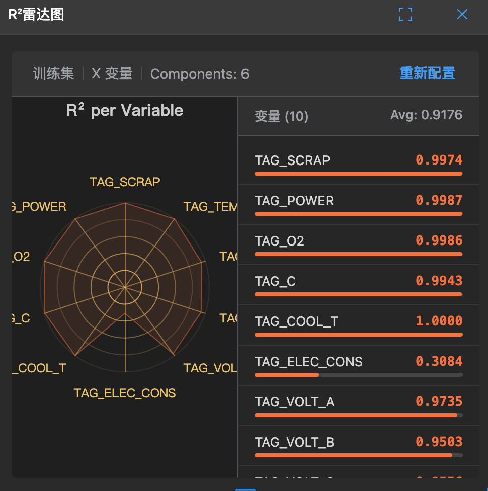
R² Radar Chart
🕸️ What is this?
This is a multi-dimensional health check report. It plots the model's explanatory power (R²) for each variable as a radar chart.
It allows you to see at a glance: Which variables does the model fit/predict accurately, and which ones does it not?
🧐 How to read?
- Radar chart: Each angle represents a variable.
- Line: The farther from the center (closer to 1), the better the model explains this variable.
- Shape:
- Circular: The model is fair to all variables and predicts them well.
- Flat: The model only focuses on a few variables and ignores others.
🛠️ How to use?
- Find weaknesses: If a certain angle is particularly concave, it indicates the model has failed on this variable.
- Adjust variables: If a certain variable is always poorly explained, is there a problem with the data? Or does it have no pattern at all?