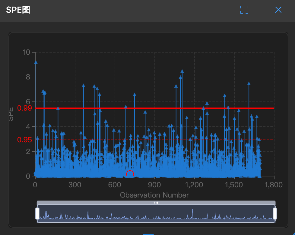
SPE Plot (DModX)
🕵️♂️ What is this?
This is the external "monitor" of the model.
It measures how far a sample point is from the model plane (residual). If a point has a large SPE, it means it doesn't belong to this model at all (ghost data).
🧐 How to read?
- Red Line (Limit): This is the warning line (95% or 99% confidence limit).
- Points:
- Below red line: Normal, everyone stays close to the plane.
- Above red line: Abnormal, floating in the air, completely unpredictable.
🛠️ How to use?
Note: This chart has a lasso function for selecting abnormal parameters.
- Catch model outliers: If a point has a very high SPE, it means this sample is very strange, possibly a new pattern (such as a process change).
- Combine with T²: If T² is normal but SPE is high, it's a new anomaly.