Core Model Algorithm Explanation
The core capabilities of the StarWay Data Insight are built on three classic multivariate statistical models: PCA (Principal Component Analysis), PLS (Partial Least Squares Regression), and PLS-DA (Partial Least Squares Discriminant Analysis).
This chapter will deeply analyze the principles, application scenarios, mathematical essence, and specific applications of these three algorithms in the platform. Understanding these models will help you better interpret analysis results and make more accurate data-driven decisions.
📊 Model Family Overview
Before diving into details, let's first see the relationship between the three models with a diagram:
┌─────────────────────────────────────────────────────────────┐
│               Multivariate Data Analysis Model Family       │
├─────────────────────────────────────────────────────────────┤
│                                                             │
│   ┌──────────────┐        ┌──────────────┐                 │
│   │  Unsupervised│        │  Supervised  │                 │
│   │              │        │              │                 │
│   └──────┬───────┘        └──────┬───────┘                 │
│          │                       │                          │
│          ▼                       ▼                          │
│   ┌──────────────┐        ┌──────────────┐                 │
│   │     PCA      │        │     PLS      │                 │
│   │  Explore     │        │  Regression  │                 │
│   │  Structure   │        │  Prediction  │                 │
│   └──────────────┘        └──────┬───────┘                 │
│                                  │                          │
│                                  ▼                          │
│                           ┌──────────────┐                 │
│                           │   PLS-DA     │                 │
│                           │  Classification│                │
│                           │  Y is Label  │                 │
│                           └──────────────┘                 │
│                                                             │
└─────────────────────────────────────────────────────────────┘
One-sentence summary:
- PCA: "What does the data look like?" → Explore internal structure
- PLS: "How does X affect Y?" → Establish predictive relationships
- PLS-DA: "Which category does it belong to?" → Perform classification
🔬 PCA (Principal Component Analysis)
What is PCA?
PCA (Principal Component Analysis) is an unsupervised dimensionality reduction technique. Its core idea is: Use fewer new variables (principal components) to retain as much information from the original data as possible.
Imagine you have a set of 3D data points. PCA finds the best 2D plane such that when these points are projected onto the plane, the "spread" is maximized - minimizing information loss.
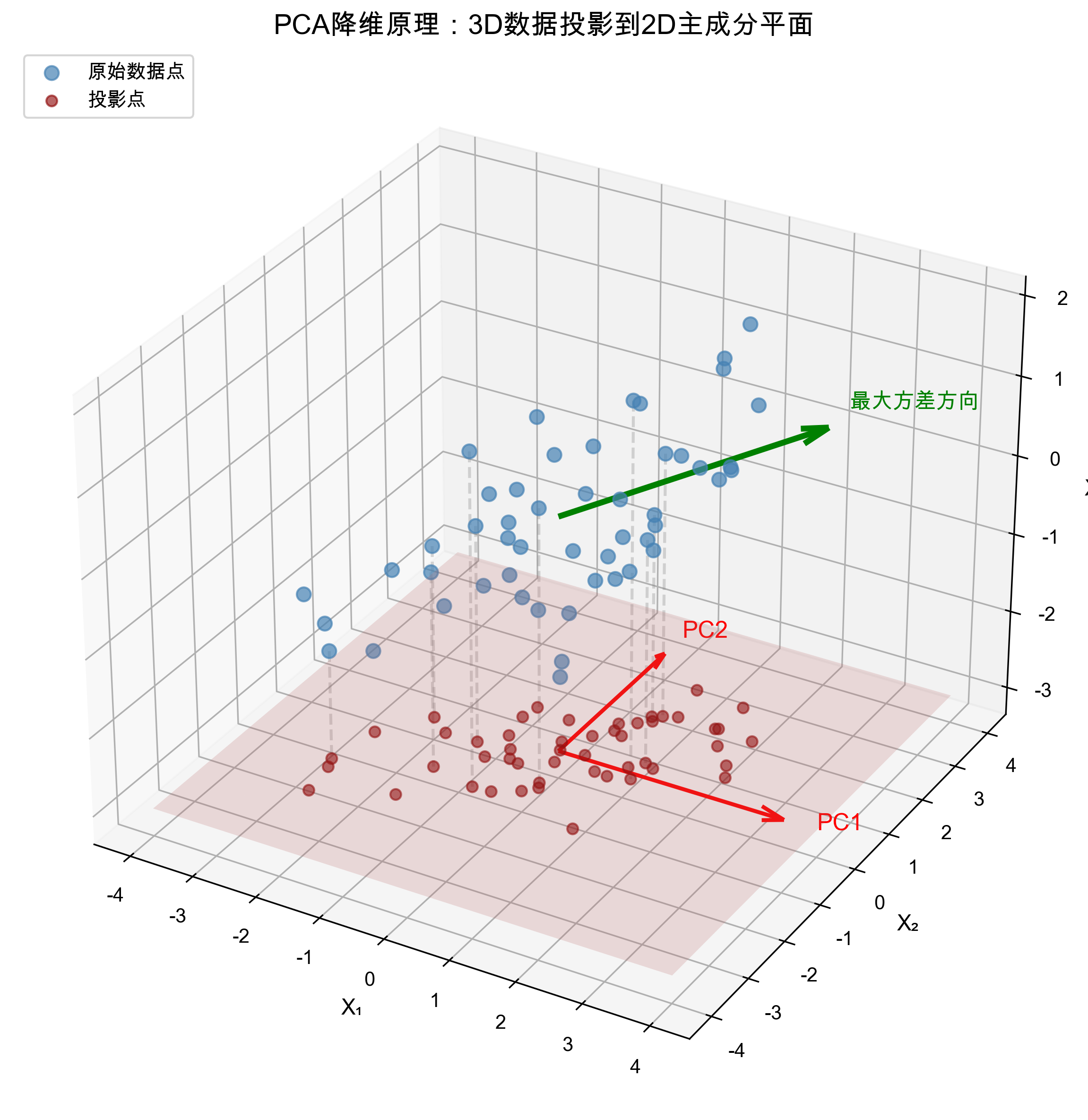
Interpretation of the diagram:
- Blue points represent original high-dimensional (3D) data
- Red plane is the optimal projection plane found by PCA (spanned by PC1 and PC2)
- Green dashed lines show the projection process of data points onto the plane
- Projected red crosses preserve information in the direction of maximum variance
Core Principles
1. Variance is Information
PCA believes: The direction with greater data variation contains more information.
- If a variable is similar across all samples (small variance), it has little information
- If variables differ significantly (large variance), they carry important information
2. Construction of Principal Components
PCA transforms the original correlated variables into uncorrelated new variables (principal components) through linear transformation:
Where:
- are called Principal Components
- are Loadings, representing the contribution of original variables to new components
- Principal components are uncorrelated (orthogonal)
3. Characteristics of Principal Components
- First Principal Component (PC1): Direction that explains the maximum variance in data
- Second Principal Component (PC2): Direction that explains the maximum remaining variance under orthogonality with PC1
- And so on...
Mathematical Essence (Simplified)
The mathematical essence of PCA is eigenvalue decomposition of the covariance matrix:
- Data Centering: Subtract the mean of each variable
- Calculate Covariance Matrix:
- Eigenvalue Decomposition:
- (eigenvalue): Represents the variance explained by this principal component
- (eigenvector): Represents the direction of the principal component (i.e., loading)
- Select Principal Components: Sort by eigenvalues in descending order, take top
Application in the Platform
Application Scenarios
- Data Exploration:初步了解数据的整体结构和分布
- Anomaly Detection:发现异常样本 through T² and SPE statistics
- Dimensionality Reduction Visualization:将高维数据投影到 2D/3D 空间观察
- Denoising:剔除噪声成分,保留主要信号
PCA Score Plot Example
The figure below shows a typical score plot of PCA analysis, where each point represents a sample, allowing you to intuitively see the distribution pattern and outliers:
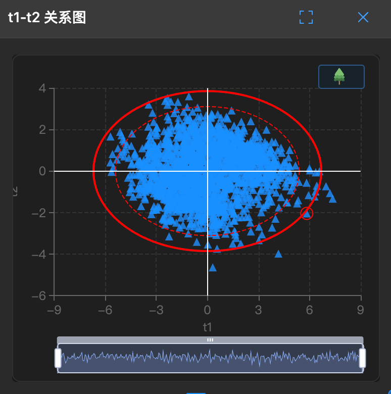
How to interpret:
- Each gray point represents a sample, positioned based on its scores on PC1 and PC2
- Elliptical area represents confidence interval (usually 95%), points outside may be outliers
- Clustered points indicate similar samples, scattered points indicate significant differences
Platform Automatic Trigger Condition
When you configure only X variables (no Y variables), the platform automatically uses PCA model:
Only X columns → Automatically select PCA → Explore data structureKey Output Indicators
| Indicator | Meaning | Interpretation |
|---|---|---|
| R²X | Cumulative explanation rate of X | How much information of X the model explains, closer to 1 is better |
| Cumulative Contribution Rate | Explanation proportion of top k principal components | Usually 80%~95% is acceptable |
| Loading | Relationship between variables and principal components | See which variables dominate this component |
| Score | Coordinates of samples in new coordinate system | Used to draw scatter plots to observe sample distribution |
Selection of Number of Principal Components
The platform automatically selects the optimal number of principal components through cross-validation, but you can manually adjust via C+1/C-1:
- Too few: Underfitting, serious information loss
- Too many: Overfitting, introducing noise
- Rule of thumb: Consider stopping when the contribution of new components to R²X is < 5%
Advantages and Disadvantages of PCA
✅ Advantages:
- Unsupervised, no need for labeled data
- Efficient computation, interpretable results
- Effective dimensionality reduction, removes correlations between variables
- Good visualization effect
⚠️ Limitations:
- Only focuses on variance structure of X, ignores Y
- Sensitive to outliers
- Principal components are linear combinations, may lack business meaning
- Assumes principal components are orthogonal, actual data may not satisfy
🔗 PLS (Partial Least Squares Regression)
What is PLS?
PLS (Partial Least Squares Regression) is a supervised regression method. Unlike PCA, PLS considers both X (features) and Y (target) when modeling, finding a latent variable space that best explains the relationship between them.
Simply put: PCA asks "How does X change", PLS asks "How does X affect Y".
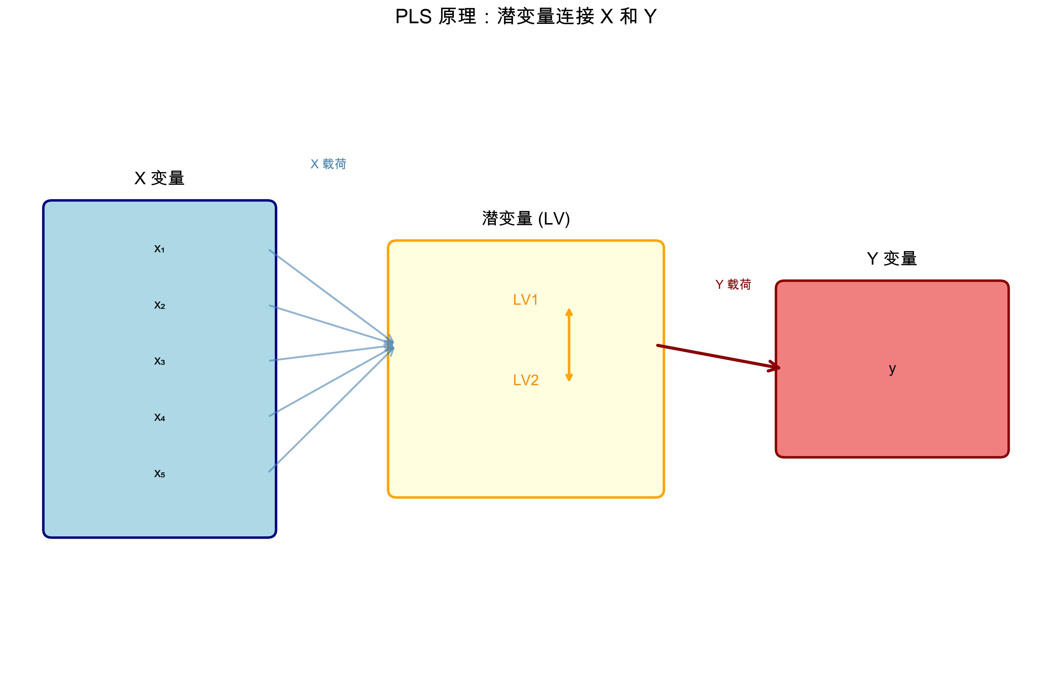
Interpretation of the diagram:
- Left blue box is X variables (X1-X5), right green box is Y variables (target)
- Middle yellow box is extracted latent variables (LV1, LV2), explaining both X and Y
- PLS aims to maximize covariance between X latent variables and Y latent variables
- Establishes X → Y prediction relationship through latent variables
Core Principles
1. Simultaneous Decomposition of X and Y
PLS decomposes both X and Y simultaneously, requiring their latent variables to be maximally correlated:
Where:
- : Score matrix of X (similar to PCA scores)
- : Loading matrix of X
- : Score matrix of Y
- : Loading matrix of Y
- : Residual matrices
2. Maximize Covariance
The core optimization goal of PLS is: Find latent variables of X and Y that maximize their covariance.
This means the components extracted by PLS must both represent changes in X and be closely related to Y.
3. Iterative Component Extraction
PLS extracts latent variables one by one through iterative algorithms (such as NIPALS):
- Find the direction with maximum covariance between X and Y as the first pair of latent variables
- Subtract the explained part from X and Y (decorrelation)
- Repeat until enough components are extracted
Mathematical Essence (Simplified)
The mathematical core of PLS is covariance maximization:
- Initialization: Start from a column of Y or random vector
- Iterative Optimization:
- (find X weights from Y scores)
- (calculate X scores)
- (find Y weights from X scores)
- (calculate Y scores)
- After Convergence: Calculate loading
- Decorrelation: ,
Application in the Platform
Application Scenarios
- Regression Prediction: Establish X → Y prediction models
- Variable Selection: Find X variables that have the greatest impact on Y through VIP
- Multi-response Problems: Y can be multiple columns (multi-response variables)
- Collinearity Handling: Stable even when X variables are highly correlated
Platform Automatic Trigger Condition
When you configure both X variables and Y variables, and Y is continuous numerical:
X + Y (continuous) → Automatically select PLS → Establish regression modelKey Output Indicators
| Indicator | Meaning | Interpretation |
|---|---|---|
| R²X | Cumulative explanation rate of X | Proportion of X variance captured by model |
| R²Y | Cumulative explanation rate of Y | Proportion of Y variation explained by model, higher is better |
| Q²Y | Cross-validated predictive ability of Y | Most critical! Reflects generalization ability, > 0.5 acceptable, > 0.9 excellent |
| RMSE | Root mean squared error | Average deviation between predicted and actual values, smaller is better |
| VIP | Variable Importance in Projection | > 1 indicates important variables, < 0.5 can be ignored |
Selection of Number of Latent Variables
The platform automatically selects the optimal number of latent variables through cross-validation, based on the principle:
- Optimal when Q²Y reaches peak
- If R²Y is high but Q²Y is low → Overfitting, need to reduce components
- If both are low → Underfitting, may need to increase components or check data
VIP Analysis
VIP (Variable Importance in Projection) is an important output of PLS, telling you which X variables are most important for predicting Y.
The figure below shows typical results of VIP analysis, where taller bars indicate greater impact of that variable on Y:
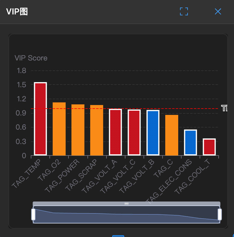
How to interpret:
- Red reference line (VIP = 1) is the threshold for important variables
- Variables above the red line (such as x3, x5 in the example) have significant contribution to Y
- Variables below the red line can be considered for removal to simplify the model
VIP calculation formula:
Interpretation criteria:
- VIP > 1: Important variables, significant contribution to Y
- 0.5 < VIP < 1: Moderately important
- VIP < 0.5: Negligible, consider removal
Advantages and Disadvantages of PLS
✅ Advantages:
- Handles X and Y simultaneously, strong predictive ability
- Effectively solves multicollinearity problems
- Supports multi-response variables
- Provides VIP for variable selection
- Works well when sample size < number of variables
⚠️ Limitations:
- Requires labeled data (Y)
- Model interpretation is more complex than PCA
- Limited ability to model nonlinear relationships
- Sensitive to outliers
🎯 PLS-DA (Partial Least Squares Discriminant Analysis)
What is PLS-DA?
PLS-DA (Partial Least Squares Discriminant Analysis) is an extension of PLS, specifically designed for classification problems. When Y is category labels (such as "pass/fail", "Class A/Class B/Class C"), PLS-DA is your choice.
Simply put: PLS predicts numerical values, PLS-DA predicts categories.
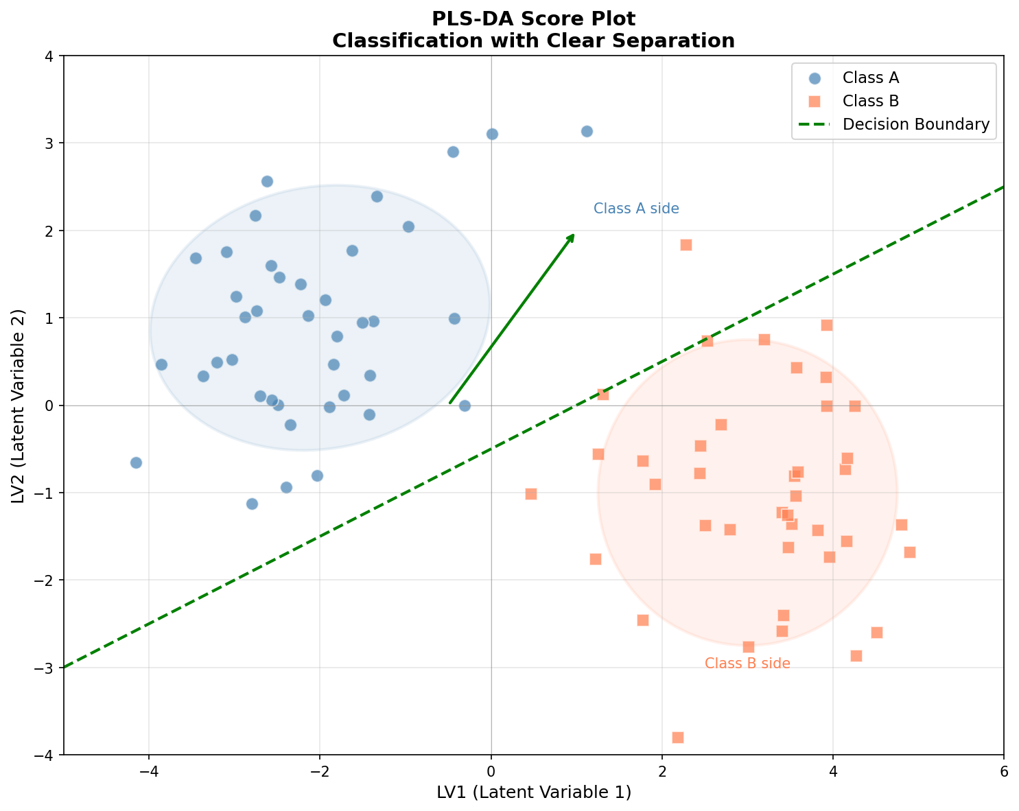
Interpretation of the diagram:
- Blue dots represent Class A, orange squares represent Class B
- Two types of samples form clearly separated clusters in latent variable space (LV1-LV2)
- Green dashed line is decision boundary, used to distinguish between two classes
- Shadow ellipses represent confidence regions of each class, less overlap means better classification effect
Core Principles
1. Convert Classification Problem to Regression Problem
The cleverness of PLS-DA lies in: Convert category labels to dummy variables, then use PLS for regression.
For example, a three-class problem (A, B, C) is converted to:
| Sample | Original Label | Y1(A) | Y2(B) | Y3(C) |
|---|---|---|---|---|
| 1 | A | 1 | 0 | 0 |
| 2 | B | 0 | 1 | 0 |
| 3 | C | 0 | 0 | 1 |
Then perform standard PLS on this multi-response Y matrix.
2. Discrimination Rule
During prediction, PLS-DA outputs "scores" for each category, and samples are assigned to the category with the highest score:
3. Visualization Advantages
PLS-DA score plots are naturally suitable for showing classification effects:
- Samples of different categories should form separated clusters in the plot
- First latent variable is usually most correlated with inter-group differences
- Second latent variable shows intra-group variation
Mathematical Essence
The mathematics of PLS-DA is almost the same as PLS, with the difference in Y matrix construction:
- Encoding: Convert category labels to indicator matrix
- PLS Regression: Perform standard PLS on X and encoded Y
- Discrimination: Select the category with the largest response value during prediction
Category encoding methods:
- Binary classification: Y = 0/1 or -1/+1
- Multi-class classification: One-hot encoding (one column per class)
Application in the Platform
Application Scenarios
- Binary Classification: Pass/fail, positive/negative, normal/abnormal
- Multi-class Classification: Raw material grading, product classification, variety identification
- Feature Selection: Find key variables that distinguish different categories
- Biomarker Discovery: Medical, omics data analysis
Platform Automatic Trigger Condition
When you configure X variables and Y variables, and Y is category labels (text or discrete values):
X + Y (category labels) → Automatically select PLS-DA → Establish classification modelKey Output Indicators
| Indicator | Meaning | Interpretation |
|---|---|---|
| R²X | Cumulative explanation rate of X | X variance captured by model |
| Accuracy | Classification accuracy | Proportion of correct predictions, beware of class imbalance pitfalls |
| F1 Score | Harmonic mean of precision and recall | More reliable than Accuracy in class imbalance situations |
| AUC | Area under ROC curve | Discrimination ability, 0.5 random, 1.0 perfect, > 0.8 good |
| Confusion Matrix | Prediction vs actual classification table | Visually see which classes are easily confused |
| VIP | Variable importance | Find key variables that distinguish categories |
Classification Performance Evaluation
Confusion Matrix Interpretation:
The figure below shows the confusion matrix of a PLS-DA model, intuitively displaying the model's predictive performance across categories:
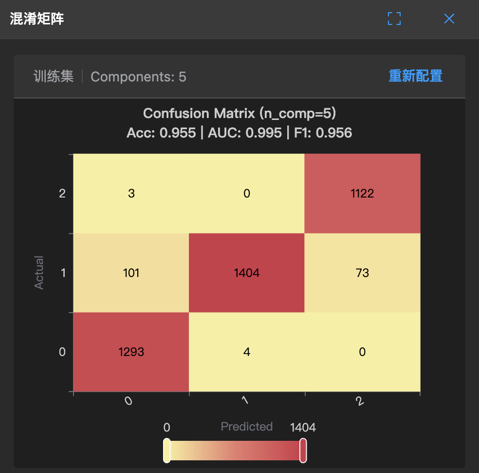
How to interpret:
- Values on the diagonal (dark color) represent the number of correctly classified samples
- Off-diagonal values represent misclassified samples
- Ideally, all samples should be concentrated on the diagonal
Confusion Matrix Table Form:
                Prediction
            Positive    Negative
        ┌─────────┬─────────┐
  Actual│   TP    │   FN    │
  Positive│(True Positive) │(False Negative) │
        ├─────────┼─────────┤
  Actual│   FP    │   TN    │
  Negative│(False Positive) │(True Negative) │
        └─────────┴─────────┘
Derived Indicators:
- Precision: —— How many predicted positives are actually positive
- Recall: —— How many actual positives are found
- F1 Score: —— Comprehensive indicator
Pitfalls in Class Imbalance:
If 95% of samples are Class A and 5% are Class B:
- Even if the model predicts all as A, Accuracy is still 95%
- But this is completely ineffective for Class B!
- Solution: Look at F1 Score, AUC, or adjust class weights
ROC and AUC
ROC Curve: True positive rate vs false positive rate under different thresholds
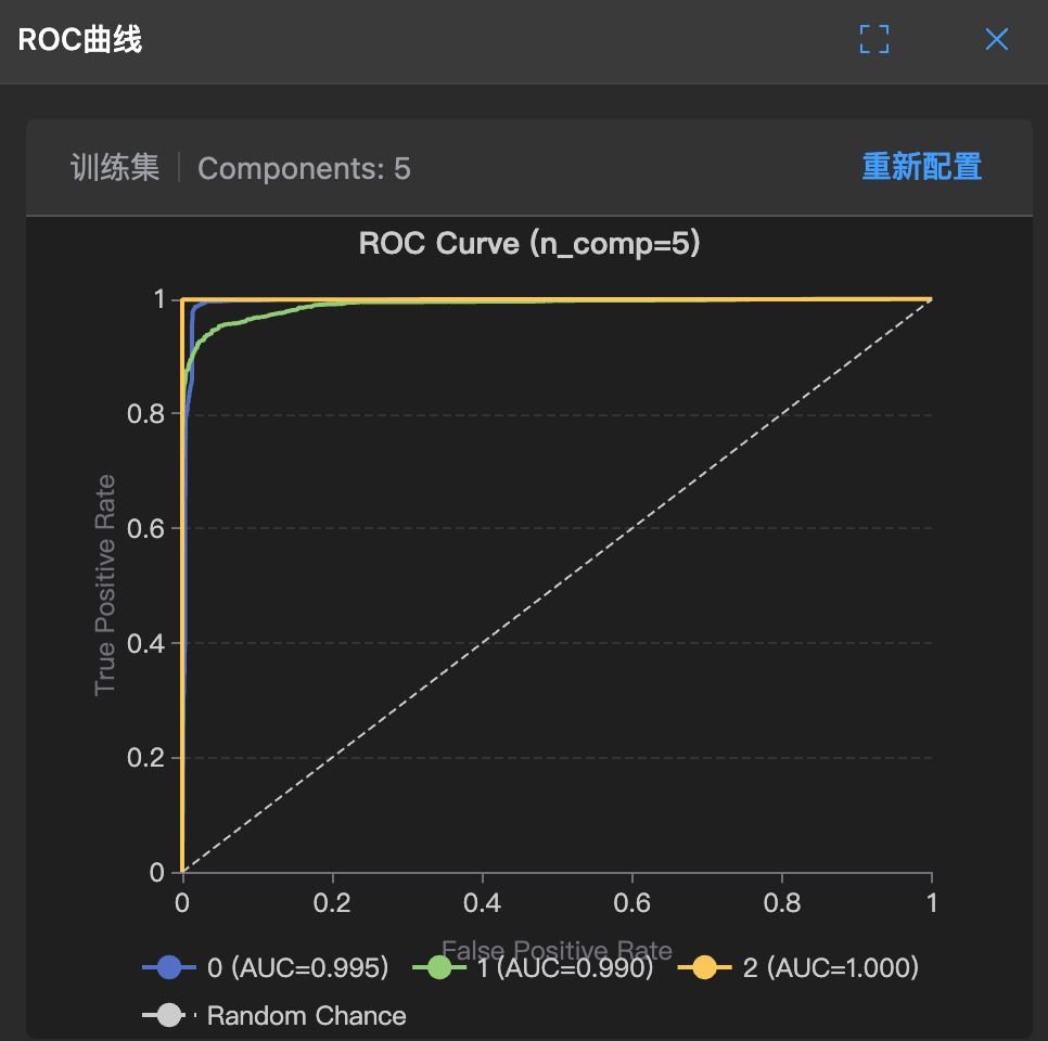
How to interpret:
- The closer the curve is to the upper left corner, the better the model
- Diagonal = random guess
AUC Evaluation Criteria:
- AUC = 0.5: Random level (no discrimination ability)
- 0.7 ≤ AUC < 0.8: Acceptable
- 0.8 ≤ AUC < 0.9: Good
- AUC ≥ 0.9: Excellent
Advantages and Disadvantages of PLS-DA
✅ Advantages:
- Suitable for high-dimensional small sample data (number of variables > number of samples)
- Handles multicollinearity
- Provides visualization (score plots show class separation)
- Gives VIP for screening discriminant variables
- More robust than LDA (Linear Discriminant Analysis)
⚠️ Limitations:
- Assumes linear boundaries between classes
- Sensitive to class imbalance
- Overfitting risk (when too many components)
- Requires strict evaluation through cross-validation
🔄 Comparison and Selection of the Three Models
Quick Selection Guide
                    Start
                     │
                     ▼
            ┌─────────────────┐
            │   Have Y variable?  │
            └────────┬────────┘
                     │
           ┌─────────┴─────────┐
           ▼                   ▼
          No                   Yes
           │                   │
           ▼                   ▼
    ┌─────────────┐    ┌─────────────────┐
    │    PCA      │    │  What type is Y?  │
    │  Explore    │    └────────┬────────┘
    │  Structure  │             │
    └─────────────┘    ┌────────┴────────┐
                       ▼                  ▼
                   Continuous           Category
                       │                  │
                       ▼                  ▼
                ┌─────────────┐    ┌─────────────┐
                │    PLS      │    │   PLS-DA    │
                │  Regression │    │ Classification│
                │  X → Y      │    │  Category   │
                └─────────────┘    └─────────────┘
Detailed Comparison Table
| Feature | PCA | PLS | PLS-DA |
|---|---|---|---|
| Learning Type | Unsupervised | Supervised | Supervised |
| Y Variable | Not needed | Continuous values | Category labels |
| Main Purpose | Dimensionality reduction, exploration | Regression prediction | Classification |
| Optimization Goal | Maximize X variance | Maximize X-Y covariance | Maximize class separation |
| Output | Principal components, scores | Predicted values, VIP | Class probabilities, VIP |
| Key Indicators | R²X | R²Y, Q²Y, RMSE | Accuracy, F1, AUC |
| Visualization | Score plots, loading plots | Prediction plots, VIP plots | ROC curves, confusion matrices |
| Sample Requirements | No restrictions | Sample size > number of variables is better | Balanced samples across classes is better |
Combined Usage Strategy
In actual projects, the three models are often used in combination:
Scenario 1: Exploration first, then modeling
1. PCA explores data structure → discovers anomalies, understands distribution
2. Data cleaning → removes abnormal samples
3. PLS/PLS-DA modeling → establishes prediction/classification models
Scenario 2: Model diagnosis
1. PLS trains model
2. Uses PCA idea to view score plots → checks sample distribution
3. Combines with T²/SPE → identifies abnormal samples
Scenario 3: Variable selection
1. PLS/PLS-DA calculates VIP
2. Removes variables with VIP < 0.5
3. Remodels → simplifies model, improves generalization
🛠️ Modeling Practice in the Platform
Modeling Process
Parameter Tuning Tips
Selection of Number of Components/Latent Variables
The platform provides C+1/C-1 buttons for manual adjustment:
| Phenomenon | Cause | Solution |
|---|---|---|
| High R², low Q² | Overfitting | Reduce components |
| Both R² and Q² are low | Underfitting | Increase components |
| Q² decreases as components increase | Introduce noise | Select component number at Q² peak |
Cross-Validation Settings
- K-Fold: Used when sample size is large (e.g., 5-fold, 10-fold)
- Leave-One-Out (LOO): Used when sample size is small
- Random Seed: Fix seed to ensure reproducible results
Model Diagnosis Checklist
After training the model, check according to the following checklist:
General Checks (All Models):
- [ ] Is R²X reasonable (> 0.5 usually acceptable)
- [ ] Are there obvious outliers in the score plots
- [ ] Are T²/SPE exceeding limits
PLS Specific Checks:
- [ ] Q²Y > 0.5 (minimum threshold)
- [ ] Gap between R²Y and Q²Y < 0.2 (prevent overfitting)
- [ ] Do high VIP variables conform to business常识
- [ ] Does the prediction scatter plot distribute along the diagonal
PLS-DA Specific Checks:
- [ ] Accuracy > 0.8 (depends on task difficulty)
- [ ] Reasonable F1 Score (must check in class imbalance)
- [ ] AUC > 0.8
- [ ] Is there any particularly poor class in the confusion matrix
- [ ] Are categories clearly separated on the score plot
📚 Further Reading
If you want to understand these algorithms more deeply, the following resources are recommended:
Classic Literature:
- Wold, S. et al. (2001). PLS-regression: a basic tool of chemometrics
- Trygg, J. & Wold, S. (2002). Orthogonal projections to latent structures (O-PLS)
Platform-Related Charts:
- Model Summary —— View overall model indicators
- Score Plot —— Sample distribution visualization
- Loading Plot —— Variable contribution analysis
- VIP Plot —— Variable importance ranking
- T² Plot —— In-model anomaly detection
- SPE Plot —— Out-of-model anomaly detection
- ROC Curve —— Classification model evaluation
💡 Summary
| Model | One-sentence understanding | When to use |
|---|---|---|
| PCA | What does the data look like? | Explore structure, dimensionality reduction, anomaly detection |
| PLS | How does X predict Y? | Regression problems, establishing prediction equations |
| PLS-DA | Which category does it belong to? | Classification problems, discriminant analysis |
Mastering these three models means mastering the core of the StarWay Data Insight. Remember: Models are tools, business understanding is the soul. Good analysis = correct model + clean data + deep domain knowledge.
Wishing you a smooth data exploration journey! 🚀